Rite aid
back-to-School
For the first concept, I challenged myself to create a back to school design without falling into the overused and cliché chalkboard aesthetic. I went with a classic composition notebook, a symbol of back to school time. The products are designed to appear like stickers stuck onto the cover of a notebook and the hand-written lettering all work together to make it look like a real student's notebook. The customized notebook is parallel to the customized approach that the consumer could be taking to home health care for flu season.
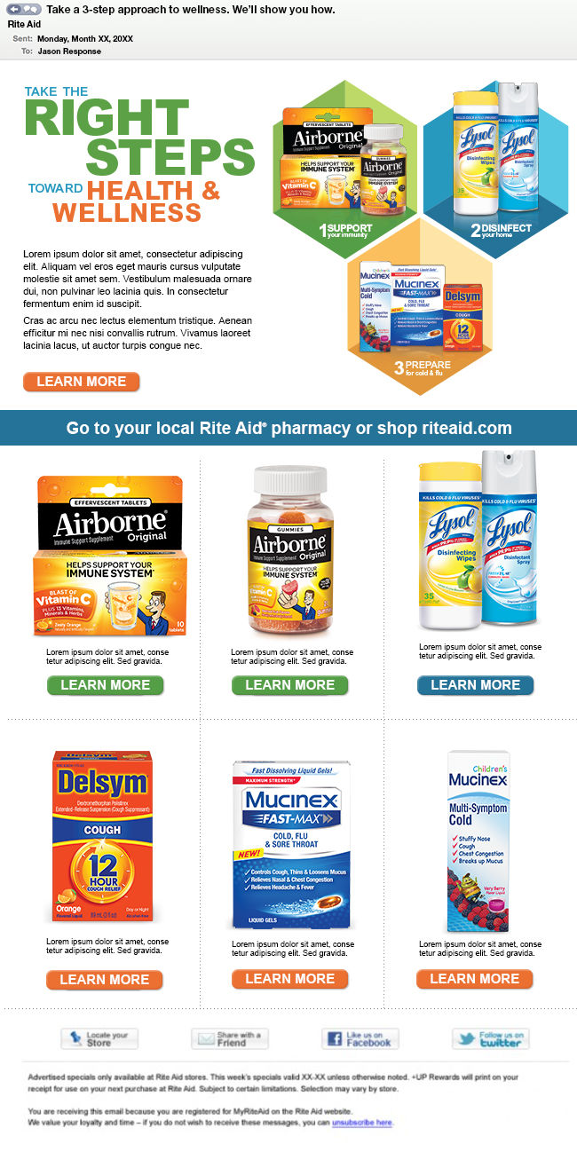
The second approach is a simple and clean modern aesthetic that works with some simple color-coding to help shoppers locate the products on the shelves. This concept is rooted in the premise that all it takes is a simple three step process to stay healthy. First, you support your immune system with vitamins. Second, you disinfect your home with cleaning products. Finally, you stock up on medicine you may need before getting sick, so you can treat it right away instead of having to run to the store after the cold or flu starts.
The third design is a deviation from concept one, in which we have multiple items that cover different aspects of care for the upcoming flu season. However, in this concept, we lose the three-step process. This approach focuses more on the product-specific areas and how they can contribute to bettering your health. The iPad takes the place of a chalkboard to give it a more modern feel.